
Week 03: Complex Simplicity
Complex Simplicity - Big Data
Weekly Learning Objectives
You will be working towards achieving the following learning outcomes detailed in the Assignments tab:
LO2: Contextualise – appraise the social, political and historical contexts in which design practice operates.
LO3: Analyse – evaluate research findings and use sound judgement informed by critical debate at the forefront of the academic discipline.
LO4: Distil – position a creative strategic insight that has been distilled and refined through an informed investigation.
LO6: Make – select and utilise relevant tools, skills and technologies in the delivery, iteration and sustainable production of an outcome.
LO7: Collaborate – demonstrate inclusive and empathetic strategies to plan and execute a project across distributed collaborative situations.
LO8: Design – realise a final solution that evidences its strategic journey and clear relationship between form and function.
Studio Practice research - Finding my narrative
Repair café - An under-valued local site
The timing happened to be very fortuitous. We had a multi-plug that had stopped working and I happened to see a Facebook advert for a local community site that meets up every 2nd Saturday of the month with a team of volunteers who will repair your household items such as Clocks, Bikes, Sewing & Fabrics, Electronics, Computing items with the ethos of repair and reuse rather than buying and adding to landfill.
I messaged the local organiser of the group and asked if I could attend and interview her to find out about this community service.
So on Saturday 10th Feb, I popped down to this undervalued local site and realised their philosophy aligned perfectly with my beliefs which is to encourage a sustainable future by bringing broken or unwanted items to be fixed instead on constantly contributing to landfill and being reliant on cheap replacement goods.
After spending the morning with Kathryn Hibbert Little, the organiser at the Repair Café, East Grinstead, I knew there were so many narratives I could connect with this project that aligned with my principles.
Keypoints to further research include:
-
how as a country (UK) we have become reliant on cheap goods (electricals, consumables, clothes etc) that are cheaply made. As a result, companies are not interested in repairing goods and have made it as difficult as possible to do that.
-
I was astounded by one of the fixers’ toolkits showing the variety of different screw heads. He explained to me that the manufacturers keep changing them so you can’t easily access devices. Should we be holding our politicians responsible for standardising fixings to avoid unnecessary waste in landfills? Surely it is in our country’s best interest?
-
This is such a great way to bring the local community together through a mixture of the repairs sharing their valuable skills, exchanging knowledge about industry products, and local people contributing by taking responsibility and action for their community.
-
The majority of volunteers are retired men who are donating their time and skillsets. They might have built up a lifetime’s worth of knowledge by working in engineering, mechanics or technology and are happy to pass this on. There is also the mental health aspect of finding their self-worth and fulfilment. I spoke to Iain, the watch and clock repairer who was a former photographic technician who had to adjust after a diagnosis of profound hearing loss. This news impacted his mental health and he said it bordered on depression. He’d always been “inquisitive about mechanical things” and after buying a clock at a car boot sale, he realised that although he couldn’t hear how it worked, he could see, and he kept himself busy by reading from books and learning more from a clockmaker friend. His survival instinct kicked in again when sadly his partner died, and he realised he needed a reason to get out of the house. He found that volunteering at The Repair Café gave him purpose and self worth and he is a valued member of the team. Since then he has also had a Cochlear implant which allows him to put his smartphone, microphone into a clock to diagnose the problem.
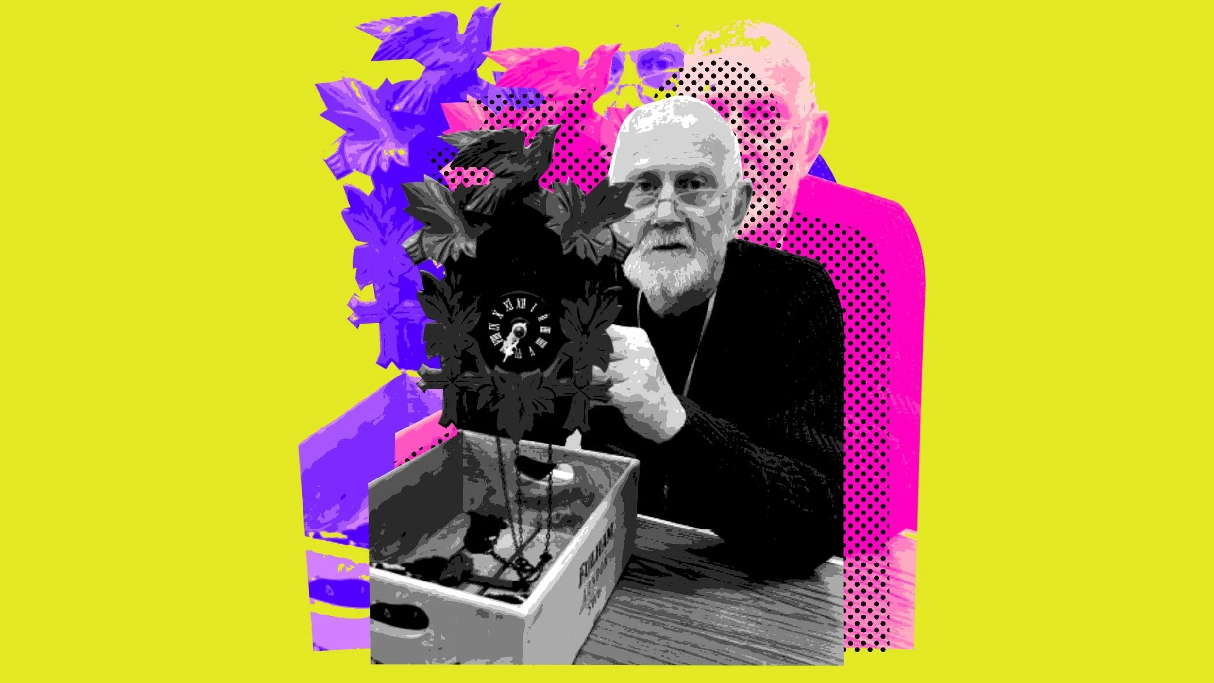
After the loss of his hearing and then his partner dying, Iain found that being part of the local community Repair Café team gave him a sense of purpose.
“It’s satisfying, and always a learning journey, and always fun.” he says.
Design Council - The Double Diamond method
Where do I go from here? It’s always good to revert to the x4 Ds Discover, Define, Develop, Deliver to work out the next steps in my project.
Working on this framework and my conversations with organiser, Kathryn Hibbert Little I needed to diagnose why this local initiative wasn’t getting the recognition it deserved.
We summed it up into these categories.
1. People didn’t realise the initiative was open for everyone to attend.|
2. People weren’t aware of the variety of items that could be repaired there. “I didn’t realise you could fix that!”
3. As it was being held in the Community Age Concern centre, people assumed it was only for people connected with the centre not for general use by everybody.
4. The initiative is run on donations and goodwill of the volunteers. (They get the centre for free). Therefore they have minimal money for advertising. “Its very much about getting our name known about this service is available for everybody”.
Week 3 conclusion
So now I had an initial concept, I needed to decide who I was targeting at and what type of graphical medium to produce.
Week 03: Lecture – Big Data
Watching the lecture made me realise how in 2024 we have even less time than ever to get our visual message across especially online. Amidst a society driven by analytics, and data-centric communication, infographics serve as indispensable tools for effectively conveying narratives. As our online interactions become increasingly fast-paced and information-dense, infographics play a crucial role in delivering bite-sized snippets of information in a visually compelling manner.
With our attention spans are dwindling and the demand for instant gratification on the rise, infographics offer a concise yet comprehensive means of capturing and retaining audience interest. Their ability to distil complex data and concepts into visually digestible formats makes them ideal for conveying narratives swiftly, especially across social media platforms where engagement is key. In a landscape saturated with content, infographics stand out by providing a visual anchor that not only informs but also resonates with audiences on a deeper level, ultimately facilitating the dissemination of narratives in an efficient and impactful way.
With my Module 720 project discussed and approved, with one of the tutors, I realised how an infographic could be essential for getting my statistics and data across to capture interest in my target audience.


Read | Watch | Listen - The beauty of data visualization
In his 2010 Ted Talk, "The Beauty of Visualization," David McCandless discusses his exploration of transforming complex data sets into captivating and accessible infographics. McCandless's talk underscores the transformative potential of visual representations in revealing hidden patterns and connections within vast data landscapes and he delves into the realm of data visualisation, and how these serve as powerful tools for simplifying complexity and enhancing comprehension.
His talk highlights the sheer volume of data generated daily, emphasising the challenge of making sense of this deluge of information. He illustrates this point with compelling examples, ranging from the anatomy of a breakup to military spending, demonstrating how visualisations can elucidate complex concepts intuitively and engagingly. By distilling the most intricate data into visually striking infographics, McCandless contends that we can unveil unseen patterns and connections, providing audiences with deeper insights into the underlying narratives within the data.
With clever colour-coded visualisation, he showcases how effective infographics can evoke emotional responses and provoke thought, to a deeper understanding of complex issues. He emphasises the importance of its aesthetic appeal. I wondered how in 2024, where information consumption is characterised by fleeting attention spans, especially in Gen Z, and an abundance of distractions, and visually captivating content becomes paramount in capturing audience interest and conveying complex data effectively.
McCandless further underscores the significance of simplicity and clarity in conveying information. By stripping away extraneous details and presenting data in its most distilled form, infographics can offer audiences a clear and succinct overview of complex topics. This approach becomes increasingly relevant today when the demand for quick and easily digestible content is at an all-time high. Moreover, McCandless highlights the democratizing effect of visualization, asserting that anyone can create compelling infographics with the right tools and techniques. He encourages individuals to embrace data visualization as a means of empowering themselves to explore and communicate complex ideas effectively.
Summary
In conclusion, even though this talk was recorded in 2010, it resonates profoundly in 2024, where the need for effective communication of complex data is more pressing than ever and in a world inundated with information overload, the ability to convey complex data swiftly and comprehensively as an infographic is a valuable skill and asset.


“Good design, is the best way to navigate information glut - and it may just change the way we see the world.”
Read | Watch | Listen - Information is Beautiful
I also accessed the website Information Is Beautiful.net is another website dedicated to presenting complex data and information through visually captivating and accessible graphics. The site features a wide range of topics, from scientific phenomena to societal trends, all presented in visually appealing charts, graphs, and infographics.
By utilising various visualisation techniques, such as colour coding, interactive elements, and innovative design layouts, it effectively communicates intricate data sets in a digestible format for audiences of all backgrounds. This visual approach not only enhances comprehension but also engages users on a deeper level, making complex information more relatable and memorable. The site's commitment to visual storytelling transforms daunting datasets into engaging narratives, empowering users to explore and understand the world around them with ease.
Here is an example of my favourite data interpretations.
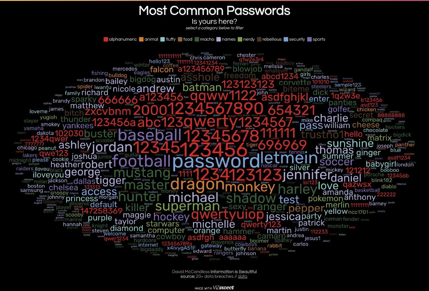
Top 500 Most Common Passwords Visualised
These are the most common used passwords deep mined from 20 separate data breaches. Hilarious that ‘password’ is at the top.
Also, after some deep analysis, they discovered that passwords fit into 11 categories including: Animal, Cool, Fluffy, Foof, Name, Pop, Password, Ride, Alphanumeric, sport and random.
References
McCandless, David (2010) The beauty of data visualizationLinks to an external site., [online] (Accessed: 9th February 2024)
Information is Beautiful (2018) Information is BeautifulLinks to an external site., [online], (Accessed: 9th February 2024)